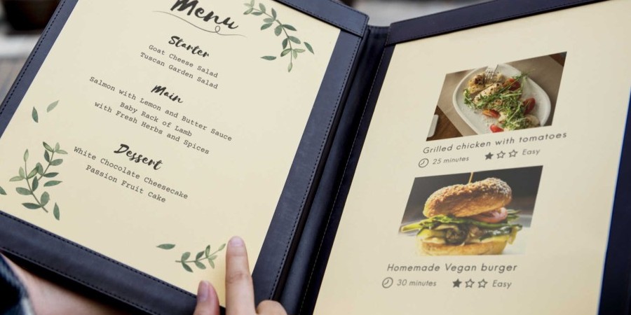
In the last article of our restaurant startup series, we delved into the licenses required to legally run a restaurant. Now, we're getting to the heart and soul of the establishment: the menu.
Every restaurant lives and dies by the quality of its food. But that food needs to be sold to the customers first through the menu. Properly designing the menu is almost like making the food listed there; it is a work of deliberate and creative decisions that engage customers. Just as with cooking, one only needs to follow a structured set of steps in order to make a winning menu.
First, start with the basics. Every item that is to be sold should be categorized into drinks, appetizers, entrees, and so on. After organizing the items into specific, unifying categories, it should be decided what order to list them in. It might be there's a specialty dish that deserves top billing. Perhaps appetizers should be presented first, or entrees should be in larger text than other sections. Essentially, use order and presentation to let customers know which items are the must-haves.
A great deal of thought should also be put into the descriptions of each menu item. While drawing up these descriptions, think about the things customers could ask about: ingredients, taste, texture, and more. Stronger descriptions produce a better picture of what customers are getting when they order it. If there is an interesting story from the kitchen or chef related to the dish, it might be worth noting in the description to draw intrigue and attention. Last but not least, flashy adjectives can help, but don't rely on them too much; the details of each dish are what's most important.
On the subject of descriptions, one might think that it's easier to show customers what they're getting using pictures. The reality is that photos are not an easy way out. Photos that are too large, distracting, or of poor quality will hurt the presentation and may even put customers off. Any photos that go on the menu should be implemented in ways that complement the menu design and require high-quality photography. Also note that photos are also great for the restaurant's social media accounts, assuming they don't fit very well with the menu.
The design of the menu should have coherence and creativity. Consider menus at chain restaurants like 4 Rivers, whose grill-intensive cuisines are represented visually in the earthy colors and designs used on the menu. There should be a rhyme and reason to the way food is presented and in what order, which colors are used, font style and size, and all other aesthetic elements. The idea is to come up with a design schematic that is unifying and makes sense for the restaurant.
……………………………..
Remember that the menu is more than just a list of what's available. It sets first impressions for your restaurant and the kind of experience that guests should expect. Therefore, it is crucial that the menu put its best foot forward with energy, neatness, and creativity.


Bad |
Rate as 5 star | Good |
||

 Filter by category. | |
| REW | 152 |
| REW Academy | 131 |
| Restaurants | 129 |
| Website Categories | 125 |
| Articles | 117 |
| Kitchen | 53 |
| Vendors | 32 |
| Tutorials | 29 |
| Food | 26 |
| Customers | 22 |
| Events | 15 |
| Interviews | 9 |
| Web | 8 |
| Funny | 7 |
| Infographic | 6 |
| Social Media | 5 |
| Trends | 3 |
 Most popular (top 5) | |
 | Life Kitchen Florida App |
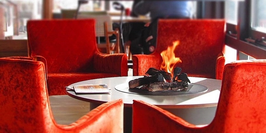 | Indoor Chairs and Bar Stools Overview |
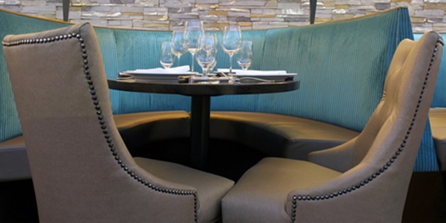 | Booths |
 | Restaurant Equipment World (REW) Launches NEW Spanish Version of Website |
 | Complete Guide to Cooking Knives |